Smart Climate Upgrades That Protect Your Investment
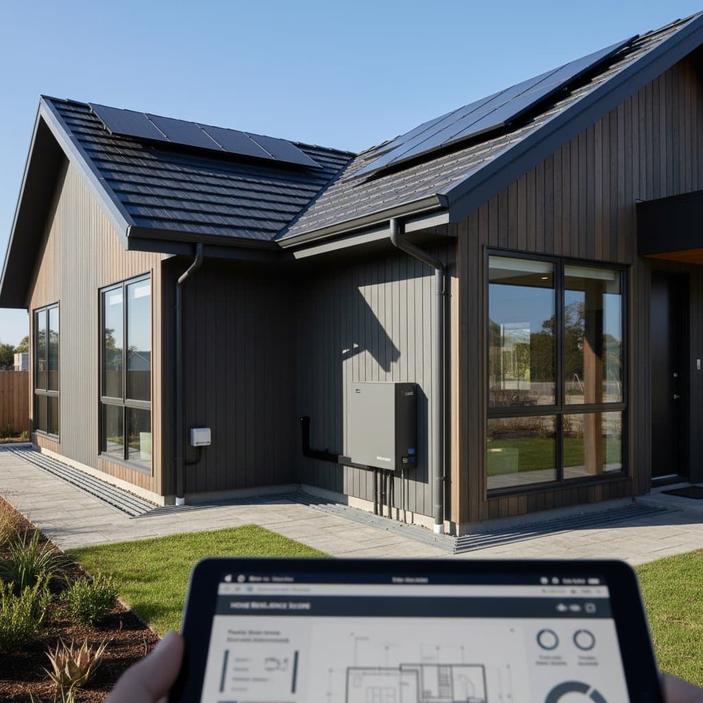
With extreme weather on the rise, smart climate-resilient upgrades have become vital for homeowners. Options such as impact-resistant roofing, flood-prevention systems, efficient heat pumps, and backup power solutions protect your property, ensure safety, and preserve value. Discover how these targeted investments can secure your home against future climate uncertainties.
By Heather Olson
3 min read